 In a recent project I have been engaged in to extend business intelligence capabilities through geographic mapping, I have had occasion to speak with several customers who are testing out this new style of reporting. One thing that has struck me in conversations with these customers is the power of geographic mapping when it is embedded within a business intelligence application to convey a message. This would be referred to as intelligent risk mapping. Customers find a certain immediacy and impact to these reports, and a message pops right out that answers certain key questions relating to their business.
This got me thinking about the reasons why this might be the case. I think it has a lot to do with the ubiquity of digital maps in our lives, the merging of the personal and the professional, and the power of pictures over tabular data.
In our personal lives, most of us have smartphones, tablets, or desktop computers where we are used to interrogating a map in order to find information we need. Mapping applications on these devices provide an easy way to ask questions such as where the good restaurants in a are; we then get a map on which we can drill through, zoom or pan to refine or get more detailed answers.
In their professional lives as well, risk and safety managers frequently try to get answers from their risk management information systems that make reference to geographic terms. These questions may include the following:
- What region has the highest claim frequency or severity?
- What properties are likely to be impacted by earthquakes?
- What countries do I have operations in where there is a high risk of political upheaval or terrorism?
- What sites have experienced a decline or increase in their loss rates?
- What is the relative performance of my locations on measure x?
- In what county are my litigation costs the highest?
- What sites have experienced an increase or decline in their property values?
And the list can go on. Since these questions are framed in geographic terms, it only makes sense that risk and safety managers would want to explore and analyze their data by viewing it on a map.
Risk Mapping: Integrating Map and Business Intelligence Applications
An interactive mapping tool integrated into the business intelligence application for a RMIS provides an ideal solution for risk and safety managers to answer these questions.
Many of the questions above, and other questions important to risk and safety managers, make reference to data elements that would typically be calculated through a business intelligence or reporting application. For example, loss rates, average litigation costs and year-over-year trends in claim costs or property values are normally calculated dynamically and displayed through a business intelligence application.
Integrating an interactive map within your business intelligence application rather than building or relying on a standalone mapping application makes a lot of sense. The data for the important questions the risk manager needs to answer will already be available in the business intelligence application. There is no need to recalculate the values or re-do any work. The mapping application will then merely be a plug-in to your existing infrastructure; it will add the visual, interactive, and intuitive experience we are all accustomed to from the mapping applications we use in our personal lives.
Immediate visualization of answers to your questions
Such an application will allow you to do the following:
- Take in the map in one glance and see immediately what locations pop out as red on a particular measurement
- Rapidly switch your view from one measurement to another by selecting items in a drop down, and watch as the color coding or symbology on the map changes
- Provide a visual method of filtering lists and charts that appear on your report, by clicking on regions or drawing boxes around points
- Move a mouse over an event or a location to get more detailed information about a location and a link to a separate report or to the record in the database
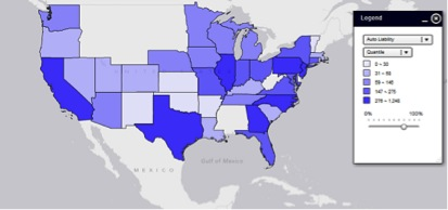
As an example, the graphic below shows clearly through the color scheme which geographic areas have a higher claim frequency. Just imagine any type of metric that is important to you in the dropdown and you will realize that almost anything in your data can be viewed geographically--allowing you to immediately grasp patterns in the data.
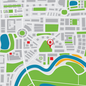
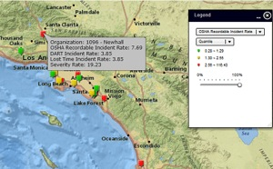
Taking things a level deeper, you may wish to see how locations within your organization compare on work-related incidence rates. The graphic below shows how the use of simple pushpins with red-yellow-green color coding can make your trouble spots stand out; methods of exploring map data such as zooming, panning and hovering over points can be deployed to get answers to important questions.
In deploying this application, I am finding that almost any traditional report used in risk management information software can be refashioned into an interactive, visually compelling geographic map. The days of pivot tables and pie charts are certainly not over, but geographic mapping provides an extremely valuable supplement to traditional risk reporting.
Mark LeVeque is a Product Consultant with Aon eSolutions, based in the Atlanta office. Contact Mark at mark.leveque@aon.com